What we know about
our user
MENU
Open to work
From “meh” to “marry me” — how I gave a wedding app the elegance it was missing.
Project Type
Redesign
Client
Gathergram
Duration
1 week
lusalcedoc@gmail.com
I’m currently available for new work,
let me know if you need a digital
designer.
I’d love to talk about the next big thing!

Outcome
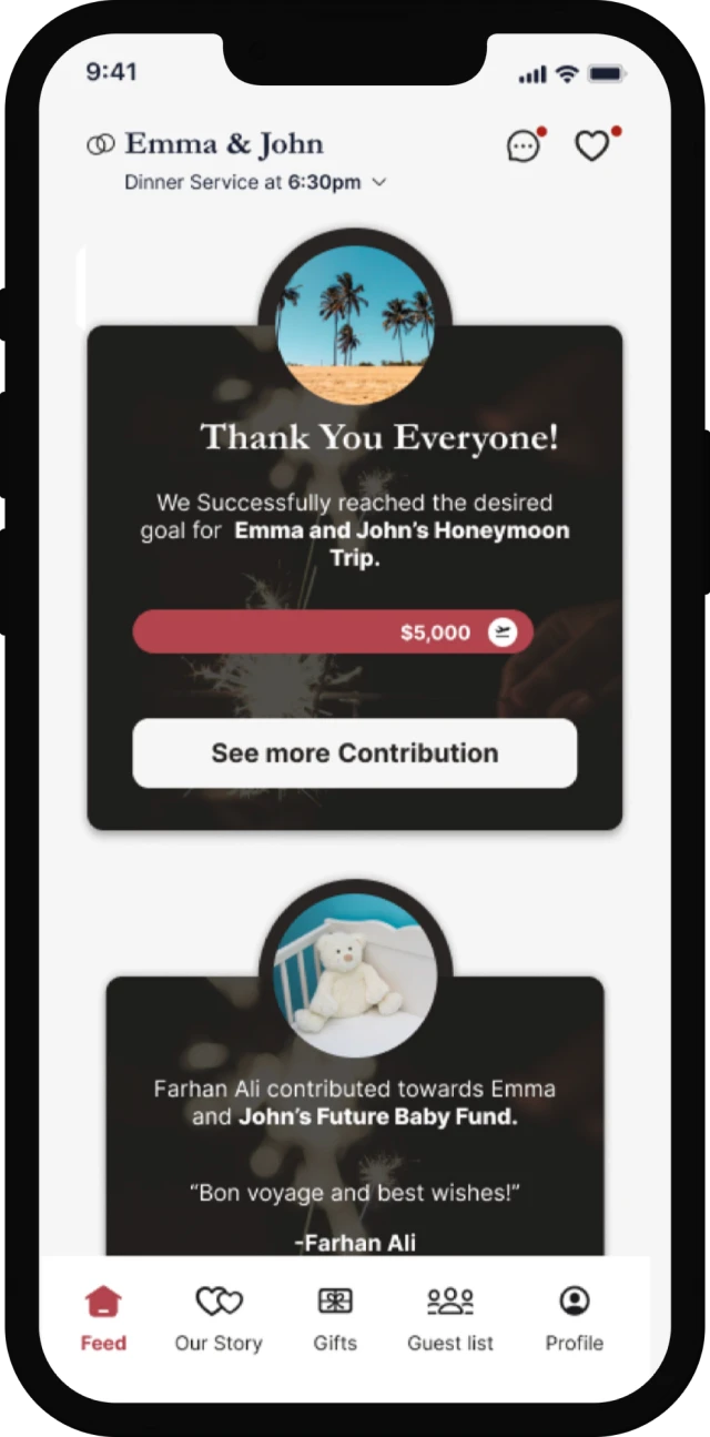
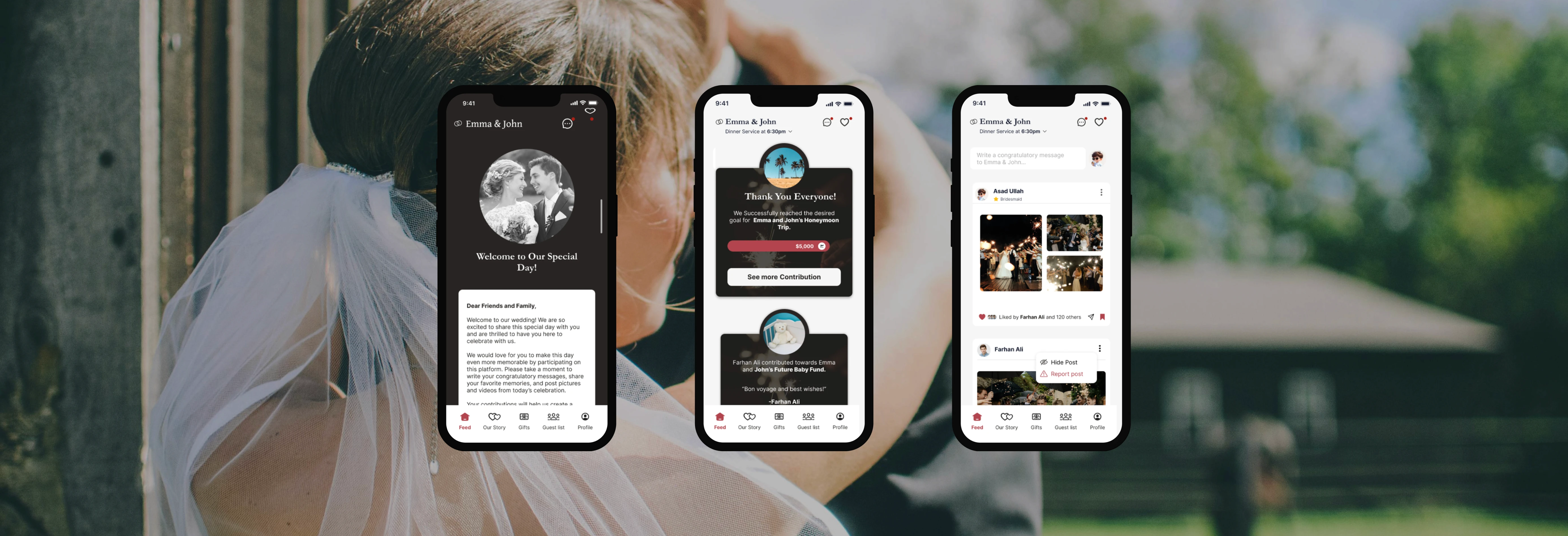
This redesign turned a generic-feeling app into a thoughtful, emotionally resonant experience—one that not only celebrates the couple but invites guests to truly feel included.
Had it launched publicly, I’d expect:
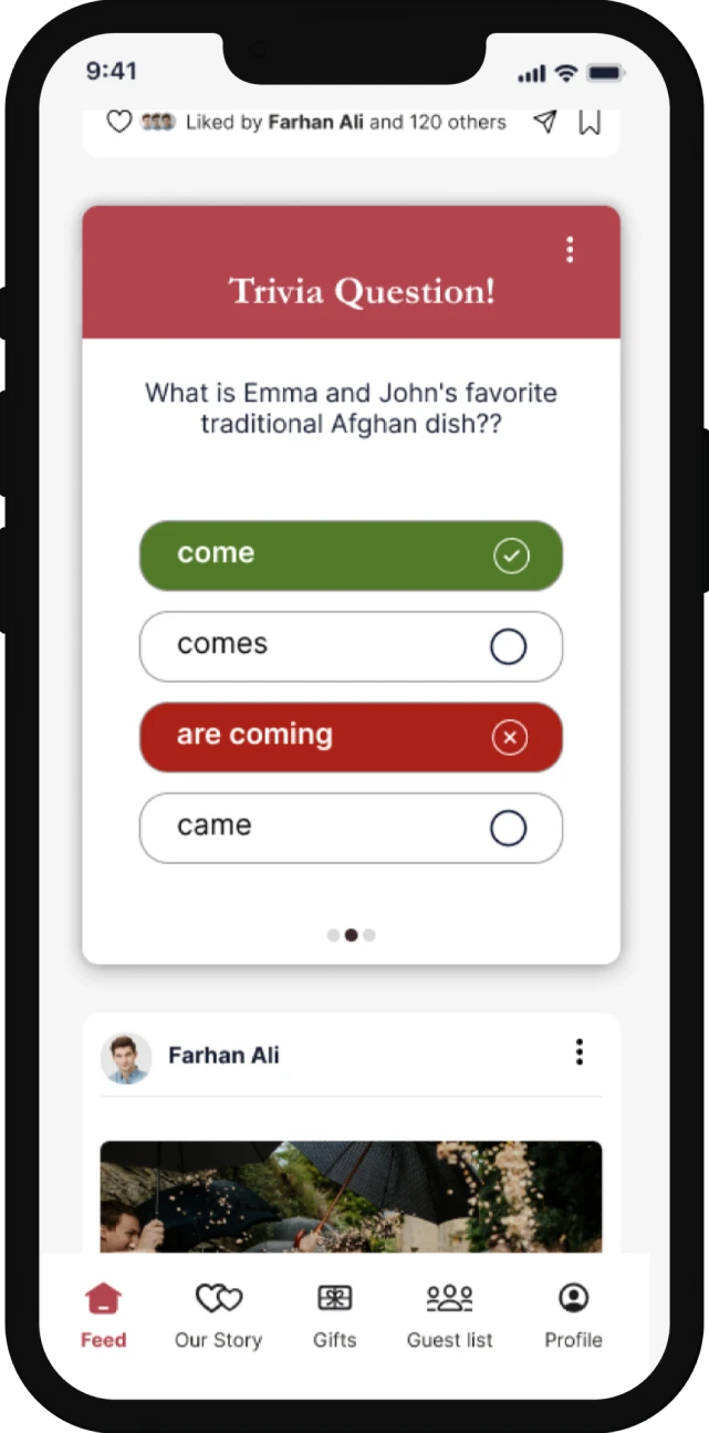
Higher engagement with contribution and trivia features.
Better usability across age groups.
A stronger emotional connection between guests and the eventExpects elegance and warmth in a wedding-related product.
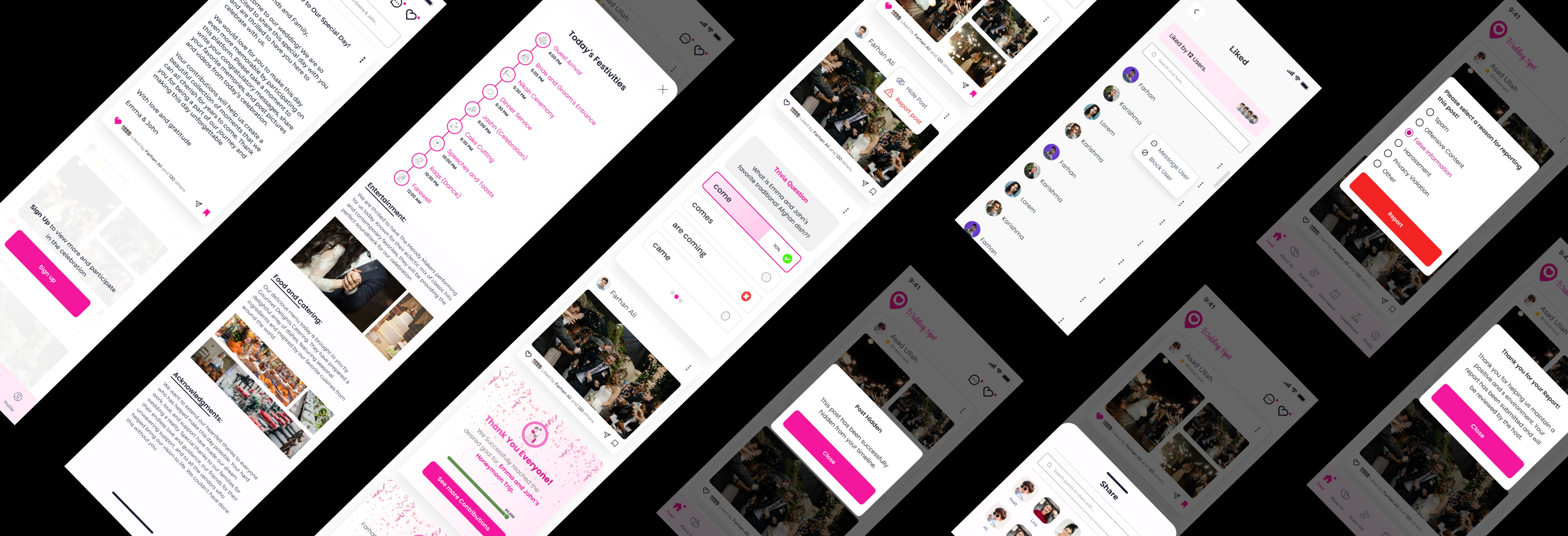
Accessible Interactions
Enlarged and refined sliders and touch areas to ensure guests of all ages could interact with ease, especially on mobile.
Improved Redability
I paired decorative headline fonts with clean body text to strike the right balance between elegance and clarity.
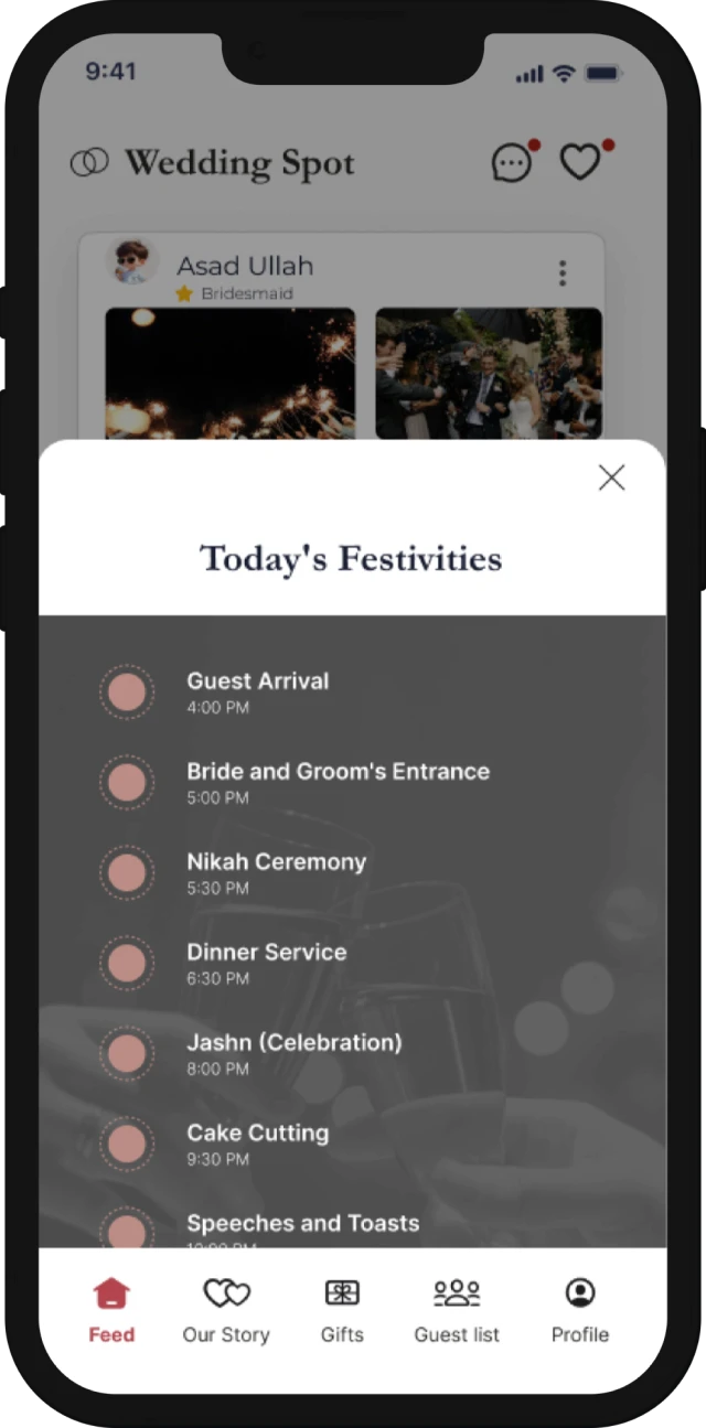
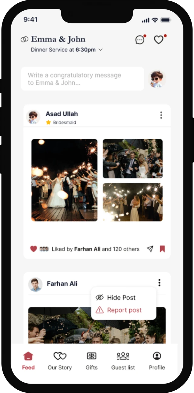
Simplified User flow
Redesigned layouts and stripped excess options to guide users naturally toward key features like contributions, timeline, and trivia—without feeling overwhelmed.
Cohesive Iconography
Redesigned every icon with a unified style and size to bring a polished, professional feel across all features.
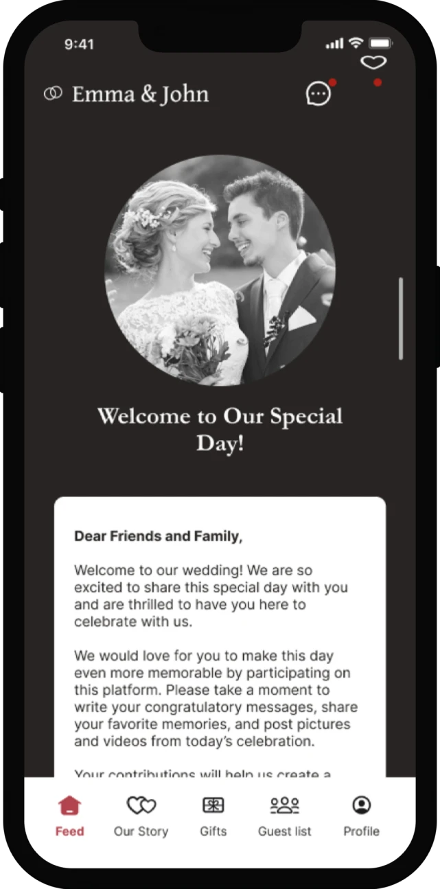
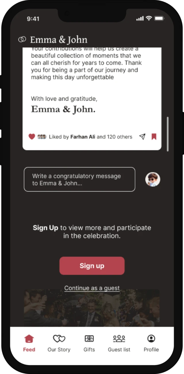
Elegant Color Palette
I swapped out the original loud pinks for a mix of muted burgundy, soft neutrals, and dark accents—evoking warmth, intimacy, and timeless celebration.
Design Decisions That Brought the Celebration to Life
This app wasn’t just about giving
information…
It was about creating a shared
emotional experience across
generations.
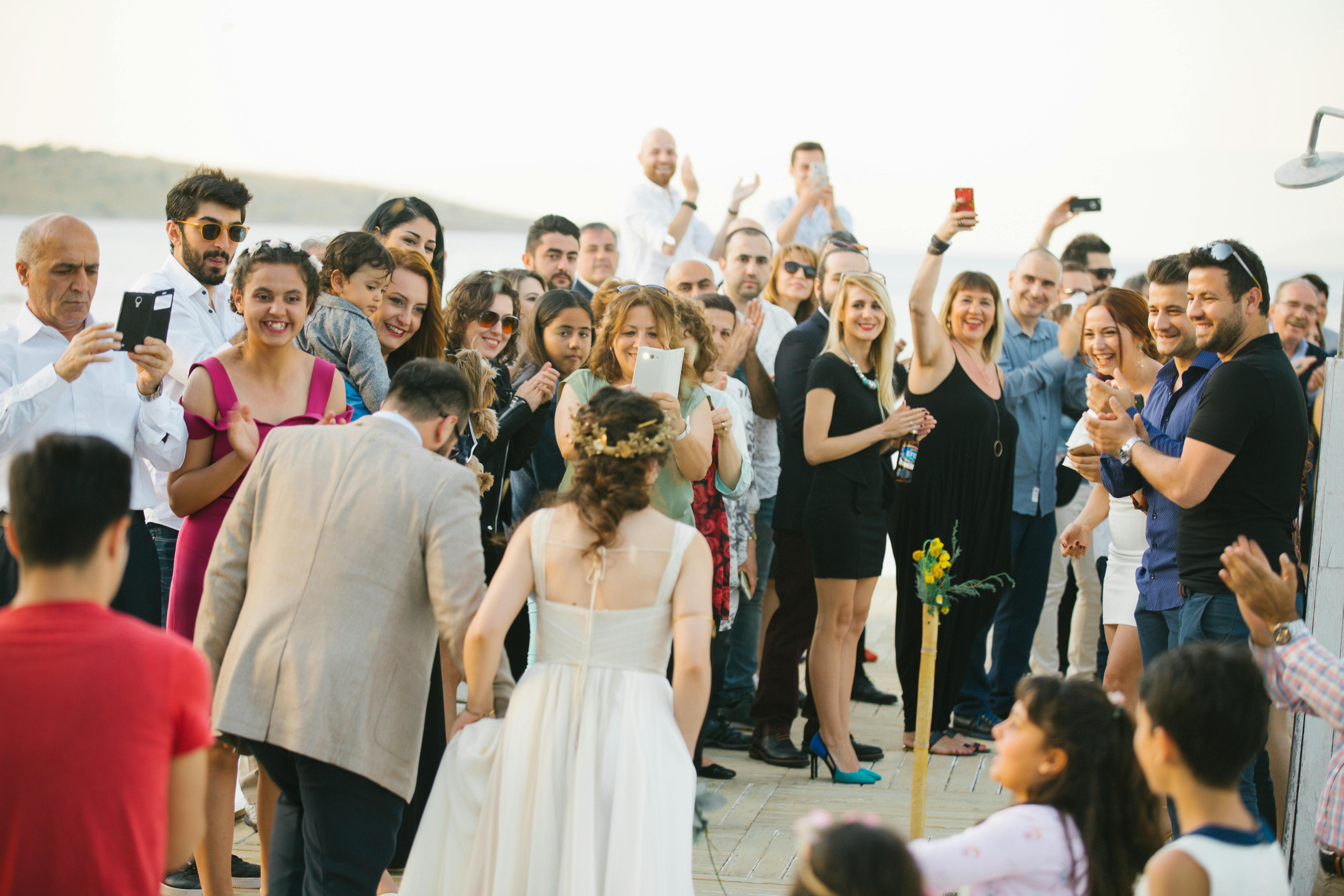
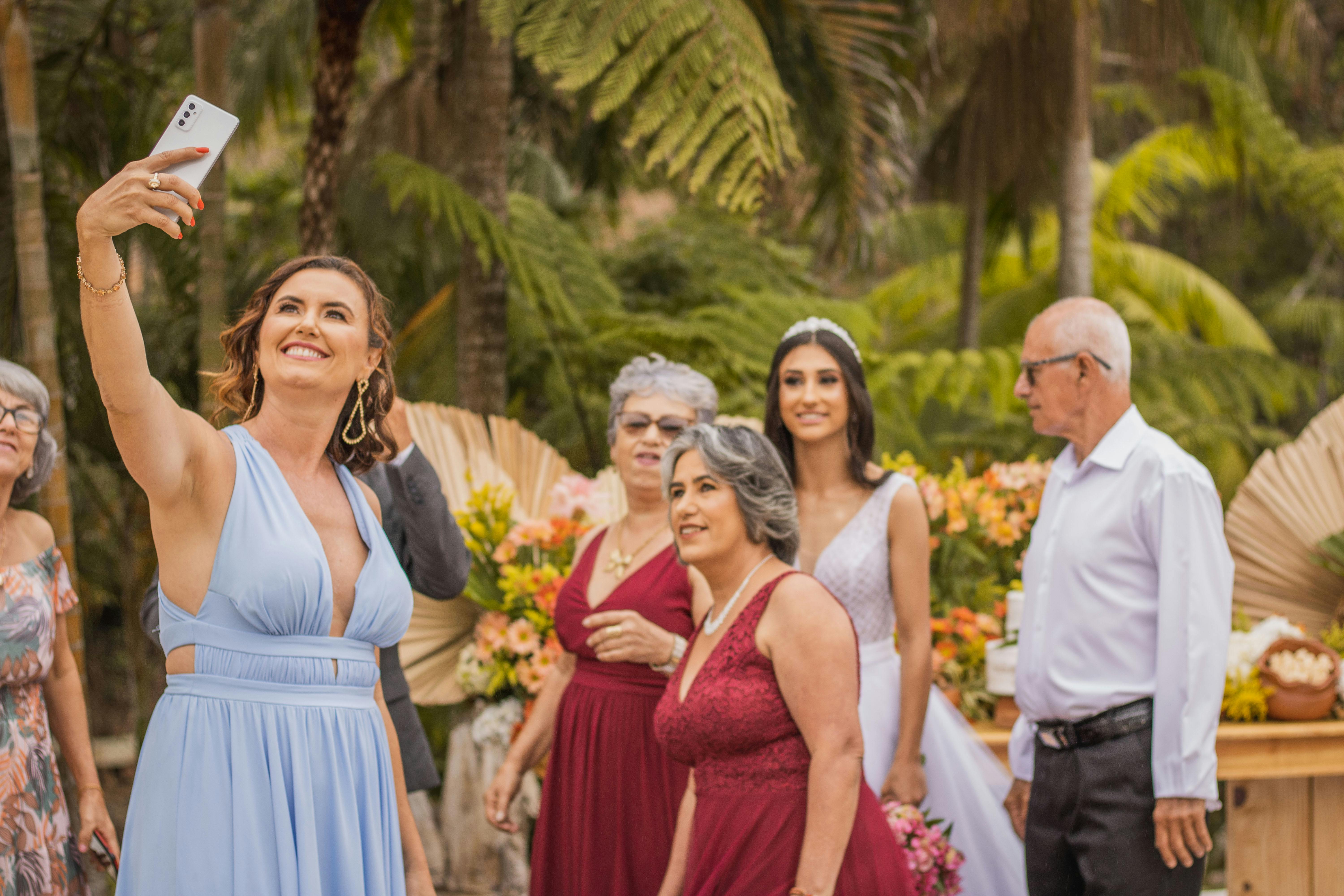
Our users are wedding guests of all ages—friends, family, coworkers—each with different levels of tech fluency and emotional connection to the couple. Some are 15, checking the app between TikToks; others are 65, just happy they remembered the password.
Expects elegance and warmth in a wedding-related product.
Wants to feel included, not just informed.
Has varying degrees of tech comfort.
May not be reading all instructions—needs intuitive design
Engages most with content that feels personal or fun (like trivia,
photo sharing)
What we know about
our user
My goal? Redesign the app to feel elegant, festive, and emotionally connected, while also improving usability and guest interaction.
The original app felt more like a casual social tool than part of a meaningful celebration. I redesigned it to feel like the big day itself—romantic, intuitive, and ready to welcome guests of all ages.
As we know, weddings are emotional, beautiful, full of meaning… this app? Not so much.
The problem
Here’s what wasn’t working:
The vibe was off: Bright pinks and basic fonts made the app feel like a random group chat, not a special celebration.
Inconsistent icons: Styles and sizes clashed, making everything feel... meh.
Tiny sliders = big frustration: Guests couldn’t easily interact with trivia or contribution features.
Too much happening, everywhere: Overloaded screens and cluttered layouts distracted from the key moments.
No emotional hook: Despite having the right features, the app lacked feeling.
Reflection
This project reminded me that aesthetics are never just decoration. When done right, they set the tone and create belonging.
Designing this app meant thinking about more than screens—I had to design an experience that felt like love, joy, and celebration.